Monday, December 12, 2011
Monday, November 21, 2011
pixlr
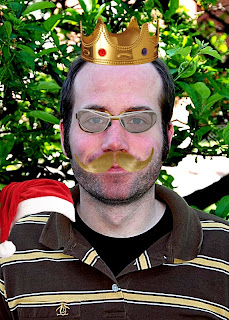
I did not do to much to this picture but i did play around with most of the tools on Pixlr. I really like Pixlr because it is a lot like photoshop but free and maybe just a little easier to use in my opinion. the layout of the screen is nice and simple with all of your tools at your finger tips from the start rather than having to go through all of the pull down menues in photoshop. However, it does not have as many tools such as gradients and other tools like that that photoshop has. I think i would recommend putting this on the website because it is free and quite easy to use. I think this website could be marketed to any age group because it is easy but the more you get to know it the more complicated things you could make with it.
Aviary
this is a piece I did for our project that explores various photo editing sites. The good thing about Aviary is that its layout is much simpler than Photoshop because the tools are clearly defined and it shows you how each tool will affect the photo. There are also many small things that you can add in to the photo that reminds me of clip art. However you can edit your picture much less in Aviary vs photoshop. Photoshop has small effects such as gradients that help change your photo a lot, while Aviary does not. This site is very easy to use and therefore would probably be directed at younger ages such as 10-14 year olds because of how simple and straight forward it is. This site is probably a little to simplistic to be put up on the website.
Friday, November 11, 2011
for this project we had to make 4 visual puns and use a new technique on each of them. I chose those four off of the sheet we had that gave us some examples. Then I used a few techniques on each of them. My favorite is the hot dog just because I thought of it instantly and really liked the result. I really enjoyed this project because it took skill with photoshop as well as some intelligence to think of the visual pun and how to portray it.
Friday, October 28, 2011
Kaleidoscope
For this project we had to follow a tutorial we viewed online and create a kaleidoscope. I chose lightning because I thought that would make a cool Kaleidoscope. I am happy with the work except for the white line that crosses diagonally across the middle. Otherwise I thought this was a good picture, though a little more could be going on in the middle. I liked this project because Kaleidoscopes are really cool, and it is awesome being able to say I have made one.
Wednesday, October 19, 2011
wahs plaque
for this project we had to take a picture and duplicate it to make it fit in four squares. Then distort some of the images. I went out to the cafeteria and saw this poster so i went out and saw this plaque and i decided that since it was spirit week I would do something that was school spirited. I really liked this project because we got to go out and take pictures, as well as being able to use our own work for the first time.
Man of Steel
For this assignment we had to create another negative space image but instead of having words in the black space, we had them around the negative space. I chose "Man of Steel" because that represents superman very well. I thought of superman because most people know him, and it is super hero day here at WAHS. I like this work because superman is awesome and it was just a fun assignment overall.
Wednesday, October 5, 2011
negative space and text
For this project we had to find an interesting and easily recognizable shape, I chose a giraffe. Then we had to cut the shape out and give it an outline. I chose green to try and make it stand out a little bit. Then in the negative space we created from the cut, we had to put in words that described the object. I googled a poem about giraffes and chose a short one, so I could include as many words as possible in the picture. I like this project because it was fun to try and think of the words that properly described the picture. I like the picture i had to cut up originally because it giraffes are cool, and have a very unique shape, which made it a really fun picture to play and tamper with.
Monday, October 3, 2011
Wordle
For this assignment we had to go on to world.net which is a cool website that takes text that you put into it, and comes out with a picture using the words, and arranging them, highlighting and enlarging words it deems important. I decided to use the opening paragraph of the preamble to the constitution. This was the first work of literature that came to my mind. I really like how wordle arranged the words, and I think this picture does the preamble justice.
Friday, September 30, 2011
15 Green Things
For this assignment we were given 15 pictures that were all green and asked to arrange them and change them to create one picture that is visually pleasing. The first main decision that i had to make was which one of the 15 pictures I should use as the background. I chose the arch, and then later on throughout the project I added things to the background such as the trees and free air sign. I changed the road/sidewalk that was in between the arches with grass and parked a car on top of it, with a parking meter in front of it. There is a woman with her cat laying in front of her, beside her crate of apples. The arch has a handicap sign showing it is handicap accesible, and also that there is a fireworks sale going on based on the fireworks sign. For this project i just threw things on the page to see how they looked and changed them as I saw fit. I am satisfied with this project it was quite challenging because you did not get to decide which pictures you were given, they were predetermined.
Monday, September 19, 2011
for this project we had to place an animal or some other object in an unusual place. I chose to place a cow on the moon, because I thought that would be very unusual. We also had to cut and paste various things onto the object to make a hybrid of sorts. I used a dog, a giraffe, and some human feet. The original background was earth, but i replaced that with a picture of tatooine from Star wars. Because I recently finished reading slaughter house five i place a trafalmadorian, which is an alien, or in this case the hand with an eye in the palm. The eye is from Lord of The Rings which are some of my favorite movies. I put an eagle in to represent the US, and decided to attach some reindeer antlers on to its head. I put the tree in to fill up some of the empty space that would have been there. This was a really fun project to do because it allowed you to be as creative as you wanted.
Friday, September 9, 2011
Before and After
For this project i had to use the lasso tool then delete the boat. I decided to use this picture because I typed cool nature pictures into google and this was my favorite choice that I saw. I really like deleting things because it is interesting to see how well photoshop fills in the space behind it. I think it does a really good job, however this boat was pretty big and the background was pretty complicated so it is far from perfect. I fiddled with it some but ended up making it worse so I went back to how photoshop filled it in.
Wednesday, September 7, 2011
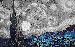
history brush starry night
I decided to use the history brush for this work of art because it is a very colorful work and I wanted to see it partially colored. I chose to keep the most colorful part in black and white, while keeping the duller part of the painting in color. I think it looks very good because the foreground is in color and the background is in color, while the entire sky is black and white. In the original painting the sky is yellow and blue and very bright, so this is a very big contrast. My biggest inspiration for using this painting was going to google, and i saw this painting on the google home page, so i decided to use it.
history brush mona lisa
I was trying to think of a picture to use for this project, and i was trying to think of famous art. This was the most famous work of art i could think of so i decided to use this. I think she looks good in black and white and the background in color rather than vice versa. I had to be very meticulous when doing the edge of her body to make sure i did not accidentally color in any part of her body. I really like using the history brush because I think you can make very interesting pictures when using it.
musicgg
This was a project we were assigned in class to show us how to use a bunch of different tools. I followed the directions and then randomly selected where to place the various objects in the picture. The biggest choice I had was whether to use the tie dye or the graffiti as the background. The other choices were what color to make each object, and what shape of eraser i should use.
Subscribe to:
Comments (Atom)


